Reimagining Digital Postal Services
Post Office Limited, a retail post office company in a European nation, has been providing essential services such as banking and cash facilities to communities across the country for over 380 years. This is facilitated by its extensive network of post office branches, operating under agreements with the nation's leading banks.
Goal
Reimagining Digital Experience and Business Growth for the Post Office by enhancing the in-branch postal service UI/UX to boost postmaster efficiency and improve customer experience.

Project Details
My Role
Co-managing 13+ designers
Stakeholder management
Project management
User research & Analysis
Building Design System
Wireframes
UI Design & Prototyping
Cross Function Collaboration
Drive UX session with the Client
Tools Used
Figma
Fig Jam
Microsoft Office
Jira
Confluence
Problem Statement
Tech Issue
Obsolet Software
Obsolete software had its own fault in design & development which made it look as though money was missing from their sites. This caused an internal crisis at Post Office Limited.
Over 50%
of Postmaster's
Time is wasted navigating through the obsolete UI and manual data entry using a legacy application. Frustrated customers are loosing trust on the brand
Over 1000
Unhappy Customers
The faulty legacy system is causing customer dissatisfaction due to slow processes.
Lack of Feedback
Caused Internal Crisis
High accountability for postmasters and inadequate internal checks, coupled with a lack of feedback mechanisms, exposed faulty software.
Over £60m loss
In Civil & Criminal Cases
The franchise was required to pay over £60 million in damages for civil and criminal suits due to the presence of faulty bugs and an outdated user interface.
Over 700
Wrongful Prosecution
The Post Office prosecuted over 700 sub-postmasters and sub-postmistresses based on information of embezzlement from faulty software
Key Emerging User Experience Issue
-
The system is difficult to navigate and lacked visual hierarchy, proper feedback mechanisms, leading to confusion and errors.
-
The user journeys are not clearly defined.
-
This caused significant distress to postmasters and negatively impacted their overall experience with the system.
-
No distinction on Service details and Basket area (Complex layout)
-
User has to discover and identify the Call to action buttons, which leads to cognitive and visual load.
-
User will have to remember, what one had selected (No affordance & signifiers)
-
Navigation is not clear, user will have to find the selected item since there is no emphasis on selection and clickable, no visual hierarchy which delay the decision making process.
-
User will have to use multiple documents to complete a transaction.
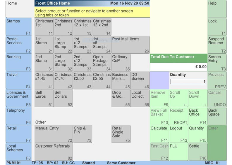
Existing UI
Project Overview

1
2
3
4
Connect with Business Analyst
Start the day by connecting with the Business Analyst to understand the functions of each business section of the post office and align the UX requirements accordingly.
Collaborate with Developer team
Meet with the Developer team to discuss the business requirements and technological constraints. Collaborate to find workarounds where needed.
Design the user experience
Release the updates to the design system and implement them across each pod to design the user journey screens. Present the updated screens to the Business Analyst and Developer team for verification.
UX & UI Design Team Meet-up
Share insights from discussions with the business and tech teams with the Design System team. Decide whether to update existing components or create new ones based on the needs and work accordingly.
Once the design system is updated, we would them proceed to demo the changes to business, tech and ux design team.
Building the Design System
I played a pivotal role in bridging the gap between design and development teams to create a robust and reusable design system. My responsibilities included:
-
Understanding Constraints: Collaborating closely with developers to identify technical limitations and ensure the design system was feasible and efficient to implement.
-
Design Collaboration: Working alongside UX designers to understand user needs and incorporate their insights into the design system, creating components that aligned with user journeys and screen requirements.
-
Mentoring: Guiding the design system team in developing a comprehensive library of UI components, style guides, and design principles.
Communication and Collaboration: Fostering effective communication between designers and developers, ensuring alignment and efficient handoffs throughout the design and development process.
Outcomes:
-
Successfully created a design system that streamlined the design and development process, leading to increased efficiency and consistency across the Post Office's digital products.
-
Improved collaboration between design and development teams, resulting in higher-quality products and faster time-to-market.
-
Empowered designers and developers with a shared language and toolkit, enabling them to create cohesive and user-centric experiences.
Design System Highlights
The design system lays down some of the accessibility guidelines with respect to use of color and navigation, for the UX designers and the Tech team to follow while creating the screens. The team has gone through a learning phase to make the design system more robust from accessibility stand-point.


The design system is easy to use for both designers and developers. It clearly defines anatomy of a component and the state, version, scope, etc.


Bridging the gap between design, business, and development teams to establish a logical flow for each component, defining use cases, states, and behaviors.
This approach provided the development and business teams with a clear understanding of the component's logic and it’s behaviour in real-life application scenarios.

Wireframe


Prototype

Please get in touch to learn more about the project's design system, usability testing, and recent updates.